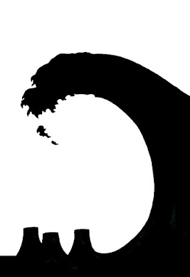
The instructor wanted us to redraw the posters at a larger size for critique. I thought the message was being diluted by having the tree and other buildings so they were removed in this version. Critique is tomorrow so it will be interesting to see if the class recognizes the nuclear reactors without the other visual clues.
Thursday: My classmates liked the first version better and it sparked a lot of discussion but the instructor and I agreed later that the revised version was a better design.

No comments:
Post a Comment